Accessibility assessment for Queer East
19 of 86 audit findings alter rendered output. 10 require a design decision.
All 19 changes
Ten items are blocked on a design decision; nine have a determined answer and are listed for visibility only. Item 01 gates five others — they resolve automatically once its token value is set.
| # | Change | Group | Decision |
|---|---|---|---|
| 01 | Muted grey gets darker, everywhere | Tonal | Token value; site-wide |
| 02 | Three form fields gain a focus ring | Tonal | Determined — ring or thickened underline |
| 03 | Form field underlines become visible | Tonal | Border token at 3:1 |
| 04 | Hover and focus stop dimming text | Tonal | None — resolved by 01 |
| 05 | Grid / list toggle needs a second cue | Tonal | Pressed-state treatment |
| 06 | Map markers get darker and bigger | Tonal | Map design pass |
| 07 | Icons vanish in Windows High Contrast | Tonal | SVG redraw or forced-colors border |
| 08 | Footer gets ~150px taller on mobile | Geometry | Accept height or restructure |
| 09 | Nav drawer links gain ~3px each | Geometry | Determined — minimum spacing |
| 10 | Filter rows gain a few pixels | Geometry | None |
| 11 | Card titles stop being truncated | Geometry | None |
| 12 | /about emails stop being clipped | Geometry | Determined — verify wrap |
| 13 | Film Index must stack and scroll | Geometry | Full-bleed treatment below threshold |
| 14 | Hover content needs a dismiss | Geometry | Dismiss handler or always-visible |
| 15 | Carousel dots gain a bigger hit area | Geometry | Determined — inactive dot colour |
| 16 | Type scale moves from px to rem | Geometry | None |
| 17 | Venue and screening access info | New | Two surfaces + tag taxonomy |
| 18 | Country list beside the Film Index map | New | Hidden list or visible list |
| 19 | An accessibility statement page | New | None — template exists |
Tonal — visible, but nothing moves
Colour and state only. No reflow, no repositioning, no impact on approved layout. Item 01 gates items 02, 04, 05, 06 and 15 — all resolve once its value is set.
The muted grey gets darker, everywhere
--color-grey: #A2A2A2 is the site's only muted-text colour. It is used 119 times across
60 stylesheets and never reaches the 4.5:1 minimum on any surface it is painted on. Every one of the
858 contrast failures in the audit is this single value.
Changing it is a one-line fix that clears all of them, and it is the most visible change in the programme: category labels, screening times, author bylines, venue cities, footer fine print and the translated film titles all become noticeably more solid.
Measured against #ffffff · #f7f7f7 card surface · #eaeaea chips.
Pick the value. Do not stop at #767676 — it is what most contrast checkers
suggest, but 470 of the 858 failures sit on the #F7F7F7 card surface, where it still fails at
4.24:1. #6F6F6F is the safe pick. #595959 buys AAA for the same effort, at the cost
of more of the pale register.
Three form fields gain a focus ring they do not currently have
The newsletter, donate and search inputs each set outline:none on :focus-visible with
nothing in its place. Measured focus-indicator contrast: zero. The only feedback a keyboard
user gets is the text caret.
The site's global focus ring is genuinely good — 2px blue at 8.59:1, clearing even the AAA standard. These three rules simply cancel it. Deleting them restores the ring already designed.
A hard blue ring may sit awkwardly on a bare underlined field. The alternative that keeps the aesthetic:
move the underline to --color-blue and thicken it on focus. Either satisfies the criterion.
Form field underlines become visible
The only boundary marking the newsletter and donate fields is --b, a 0.75px #EAEAEA
rule at 1.2:1 against white. The minimum for a control boundary is 3:1. The search input has
no boundary at all.
Worth noting how these compound: the fields have a visually hidden label, a near-invisible border and no focus ring — so the placeholder is currently the field's only visible identity, and that sits at 2.55:1 too.
Introduce a separate boundary token. #8F8F8F gives 3.23:1 on white and 3.02:1 on cards. Keep
--color-grey-mid for decorative rules — only the four that bound actual controls need to change.
Hover and focus currently make text harder to read
14 rules set text to the muted grey on hover and focus, so interacting with a link drops it from 8.59:1 to 2.55:1 — including the primary “Add to Basket” and “Book” buttons. Scanners never caught these because they only test the resting state.
Item 01 fixes them automatically. The pattern is worth a look though: a hover or focus state should raise contrast, not lower it. If the intent was to dim, something other than colour should carry it.
The grid / list toggle needs a non-colour pressed state
The inactive icon sits at 2.12:1, and the list glyph is a 0.75px rule at that
contrast. More importantly the pressed state changes only the glyph's hue — the button chrome is
identical in both states, so the selection does not survive greyscale or high-contrast mode.
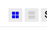
Give the pressed button a second cue — a filled ground with an inverted glyph, or a border. Item 01 lifts the inactive icon to roughly 4.5:1 on its own, but the state ambiguity is a separate problem.
Map markers get darker and bigger
The Film Index country dots are #A2A2A2 at 2.18:1 on the land fill and need 3:1.
They are also 12px across against a 24px minimum, so circle-radius goes from 6 to 12 — a visible
change in the map's density.
Related: Hong Kong and Macau sit 5.5px apart and already render as one blob. Doubling the radius makes that worse, so they need a collision offset or a stroke.
The land, sea and border fills deserve a look independently — #ededed land against
#f7f7f7 sea is 1.09:1, and the country borders are 1.16:1. The geography is
effectively a flat field right now.
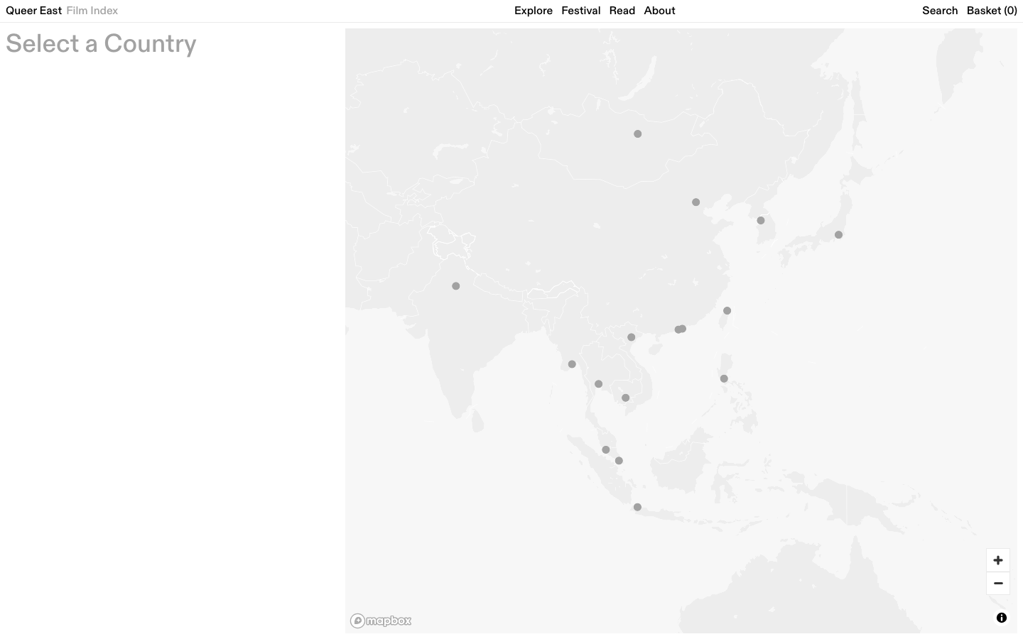
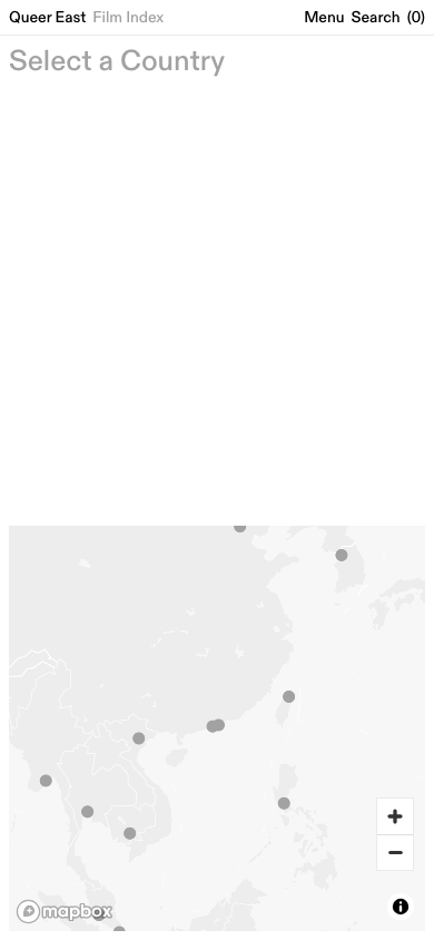
This is a map design pass, not a token swap: marker colour, marker size, collision handling, and whether land, sea and border separation should be readable at all. Selection is also a pure hue swap today — it needs a size or stroke change to read without colour.
Icons disappear entirely in Windows High Contrast
Icons and indicators are drawn as background-coloured <span> elements rather
than glyphs or SVG. Forced-colors mode strips backgrounds, so the view toggle, the event status dots
and every chip fill vanish completely. Text is rescued correctly; the icons are not.
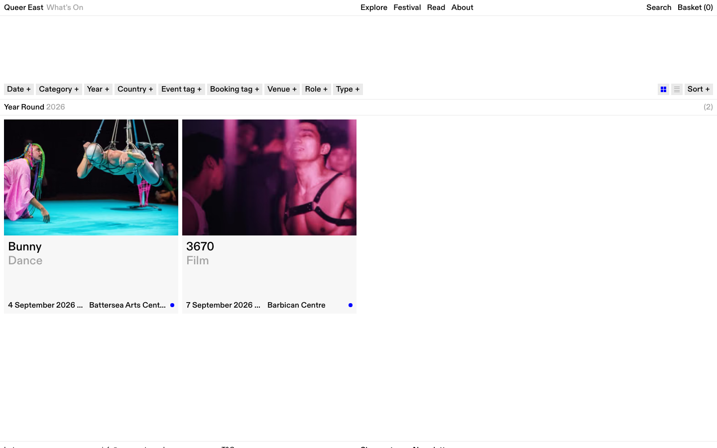
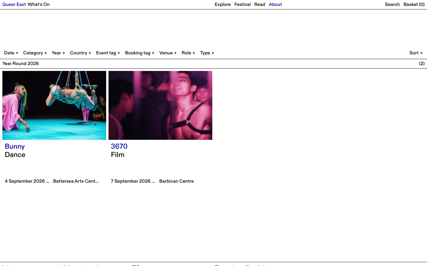
Redraw these as SVG with currentColor, or as text glyphs — the filter option list already does
this correctly with ○ and ●. Alternatively add a forced-colors block giving each a
CanvasText border.
Geometry — things that move
578 target-size failures reads as a layout rewrite. It is not — WCAG 2.2 permits target size to be satisfied by spacing rather than padding, so most cases resolve by adding gap, not size. Only item 08 is genuinely unavoidable.
The footer gets about 150px taller on mobile
The social, contact and legal links are display:block; width:100% at the small type size, so 12
links stack one per line at 11.6px pitch with zero gap. The measured safe clickable diameter
is 0.0px — adjacent targets touch exactly.
Reaching the 24px minimum costs about 12.4px per link, whether by padding or by gap. Twelve links, so roughly 150px of extra footer height on mobile and 107px on desktop. This is the one fix in the whole programme that cannot be made free.
Either accept the taller footer, or restructure. Two columns on mobile would absorb most of it, and the legal links in particular could sit inline rather than stacked.
Nav drawer links need about 3px more room each
Drawer links are 22px tall at 20.9px pitch with no gap, so their target circles overlap. The audit proposed 12px of padding per link, which would add roughly 155px. The spacing route needs only about 3px per link — roughly 40px across the drawer.
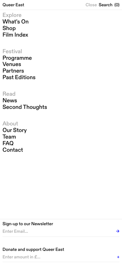
3px is nearly invisible and clears the requirement. More generous spacing reads better but pushes the lower links further down — and at 400% zoom the drawer already shows only about 2.5 links at a time (item 13).
Filter option rows gain a few pixels each
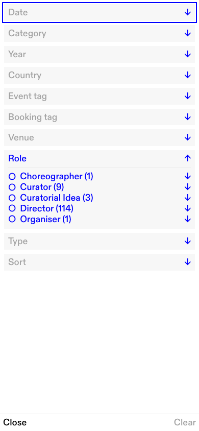
Every checkbox and radio row is a zero-padding label at 20.9px pitch. The real
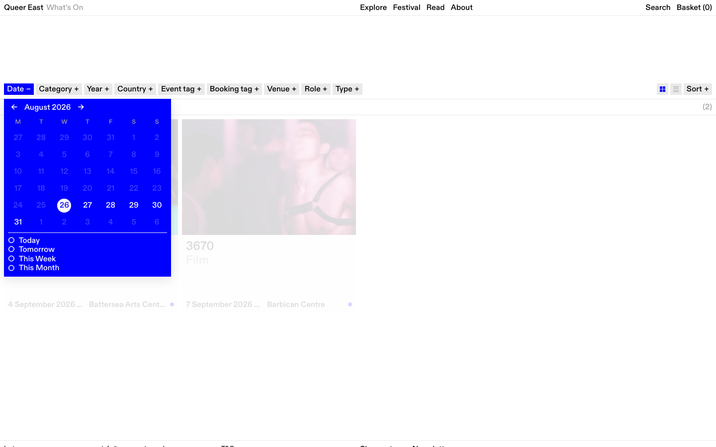
<input> is clipped to 1×1px, so the label is the target. The calendar quick-range
rows measure a safe diameter of 0.1px.
Adding around 3px per row inside a container that already scrolls is effectively unnoticeable — though with up to 98 options in the modal it adds roughly 300px of scroll length.
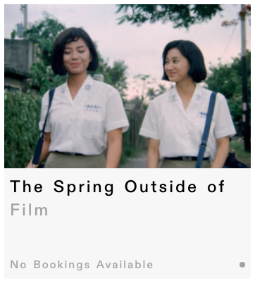
Card titles stop being silently truncated
Card bodies use a fixed height: 157px with -webkit-line-clamp: 2. When a reader
applies the standard text-spacing adjustment — a documented AA requirement — titles push out of the clamp and
are cut off with no ellipsis. On the programme page one title loses 75px of
content and renders as “The Spring Outside of”.
The fix is nearly free. Swapping height for min-height produces
zero visual change at default settings — the cards sit in a repeat(4, minmax(0,1fr))
grid, and grid already stretches row siblings to match. A row grows only when a title genuinely needs a third
line, and the cards within it stay aligned.
Contact emails on /about stop being clipped
The contact email links overflow their grid column and are cut off by overflow-x: clip at
every viewport between 781px and 1338px — exactly where 200% zoom lands a normal desktop
window. A maximised 1920px screen at 200% renders submissions@queereast.org.uk as
“submissions@queerea”.
One of the two affected links is, with some irony, the Accessibility contact address.

Adding overflow-wrap: anywhere fixes it — the grid already uses minmax(0, 1fr), so
wrapping is all that is missing. A wrapped email address across two lines is a look worth checking though.
The Film Index has to be allowed to stack and scroll
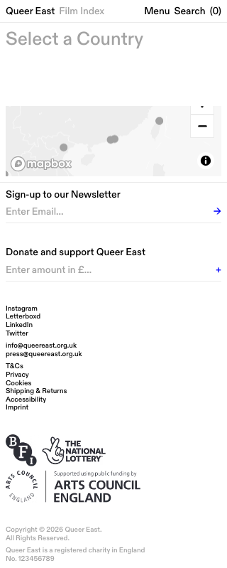
The page locks itself to viewport height with overflow: hidden. At the 400% zoom condition the
map collapses to 99px tall and the zoom-in control is clipped out of reach, with no scroll to
recover it. Since the map is the page's only navigation, the page becomes inoperable.
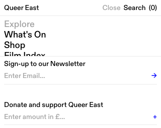
Below a height threshold, let the page stack normally instead of filling the viewport. That changes the Film Index's defining full-bleed treatment at small sizes — worth deciding deliberately rather than letting a media query decide it. Same question for the drawer, where the two forms should shrink or scroll with the links.
Hover-revealed content needs a way to dismiss it
Two hover behaviours reveal content that overlays other content and cannot be dismissed without moving the pointer. Event card badges cover the bottom 26px of the card image. The archive row thumbnail is a 220×140px panel that follows the cursor, so it can never be hovered off either.
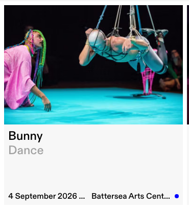
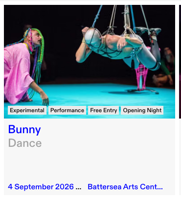
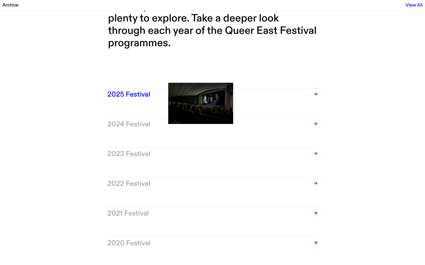
Simplest fix is an Escape handler that hides them. For the card badges there is a cheaper option: they are already permanently visible on mobile, so making that universal removes both the problem and the interaction. That is a design preference, not a technical one.
Carousel dots keep their size but gain a bigger hit area
The slide indicators are 8×8px dots 6px apart — a safe clickable diameter of 4px against a
24px minimum. Inactive dots are also #EAEAEA on white, which is 1.2:1 and so
effectively invisible.
Transparent padding with background-clip: content-box keeps the painted dot at exactly 8px while
the target grows to 24px. The visual stays identical — only the inactive colour needs a decision.
The type scale moves from px to rem
Every font size is an absolute px token, so a reader's browser font-size preference currently has literally no effect on this site. Converting at 16px = 1rem renders identically at default settings — it changes behaviour only for someone who has asked for larger text.
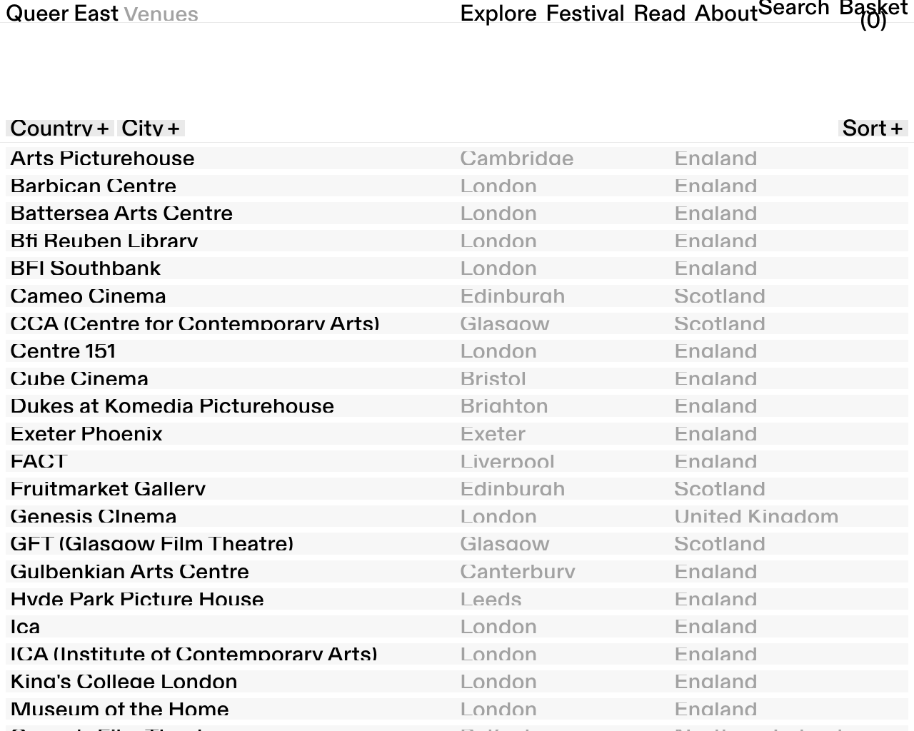
Why it matters: with type doubled, clipped containers jump from 2 to 123 on /venues, because
single-line text sits in line-height-height boxes with overflow: hidden. Those need
min-height too.
New surfaces — things to design
Three surfaces that do not currently exist. Item 17 ranks highest in the audit by user impact — above every technical finding in this register.
Venue and screening access information
The venue schema has four fields: name, url, city, country. There is nowhere to record step-free access, a hearing loop, an accessible toilet, wheelchair spaces or an access booking contact — so an editor cannot publish it even if they want to. Thirty venues are live with none of it.
A keyword sweep across /venues, /about and an event page for
step-free, wheelchair, hearing loop, audio described, relaxed, lift, accessible toilet returned
zero hits. BSL, Captioned and Subtitled tags do exist in the CMS — applied to
zero events.
For an arts charity this typically carries as much weight as technical conformance. A screen-reader problem can be worked around; not knowing whether the building is enterable cannot.
Two surfaces: an access block on the venue row or venue detail, and per-screening access badges on the event page. Plus an “accessible screenings” filter, which the existing chip pattern can carry. Worth designing the taxonomy alongside — the current tag list mixes access (BSL, Captioned) with marketing (Opening Night, Free Entry) in one undifferentiated row.
A country list beside the Film Index map
The map is currently the only way to select a country, and it is a GPU canvas layer with no DOM nodes — so it cannot be reached by keyboard at all. A full tab traversal is 31 stops and none reach a country. The entire visible text of the page is “Select a Country”.
The content already exists: deep-linking ?country=japan renders a correct heading and a working
list. Rendering the countries as real links resolves four separate failures at once.
This can be a visually hidden list — costing nothing and changing nothing — or a visible list beside the map, which is better for everyone and arguably a better page. That is the call: minimum compliance, or an actual improvement.
An accessibility statement page
The footer already links to /accessibility. That route returns 404, as does
/imprint. The site advertises a statement that does not exist, which reads worse to a reviewer
than having no link at all.
Minimal design work — the legal/[slug] template already handles privacy, cookies, terms and
shipping. It needs content, not layout. One caveat: those legal pages currently render no heading at all, so
the template needs an <h1> adding first.
No visual impact
The remaining 67 findings alter no rendered output. Listed by area for completeness; no design review required.
| Area | What changes | Visual impact |
|---|---|---|
| ARIA roles and structure | Gallery tab roles removed, calendar rows added, radiogroup moved off list elements | None |
| Focus management | Focus moves into menus and popovers, returns to trigger on close, background made inert | None |
| Status messages | Visually hidden live region announcing result counts after filtering | None |
| Headings | h1 added per route, per-card headings on programme pages | None if styled |
| Duplicate IDs | Footer forms switched to generated IDs | None |
| Alt text | 261 gallery images backfilled, 8 schema fields made required | None |
| Language | lang added to CJK, Thai and Devanagari title translations | None |
| Keyboard | Space key no longer swallowed, scroll padding added so focus clears sticky bars | None |
| Reduced motion | Carousels respect the preference, three smooth-scroll calls gated | None by default |
| Forms | Newsletter wired to a real provider, donate amount parsing fixed | None |